ECHO
How can we build meaningful connections in a post-growth world where wellbeing has improved and people already understand what truly matters?
[ PROJECT OVERVIEW ]
The global internet currently accounts for around 4% of global greenhouse gas emissions. While digital technologies have enabled unprecedented levels of connection, many people still experience increasing loneliness and social isolation.
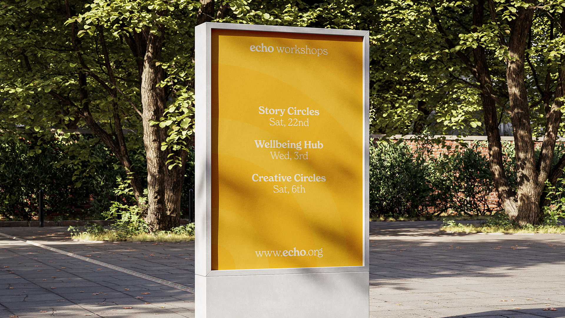
ECHO responds to this contradiction. It proposes a one-day event designed to encourage meaningful, in-person connection in a post-growth society. Through workshops, shared activities and open discussions, the event creates space for people to exchange ideas, build relationships and support collective wellbeing.
By bringing people together physically rather than digitally, ECHO explores how design can foster community, strengthen social bonds and promote more sustainable ways of connecting.
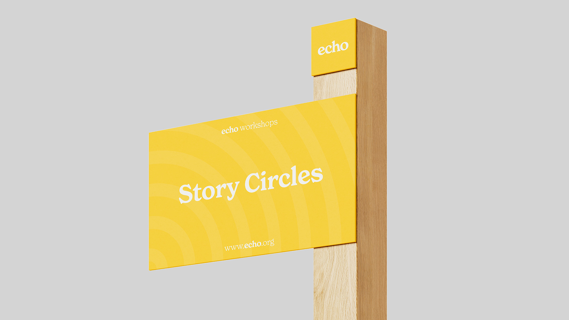
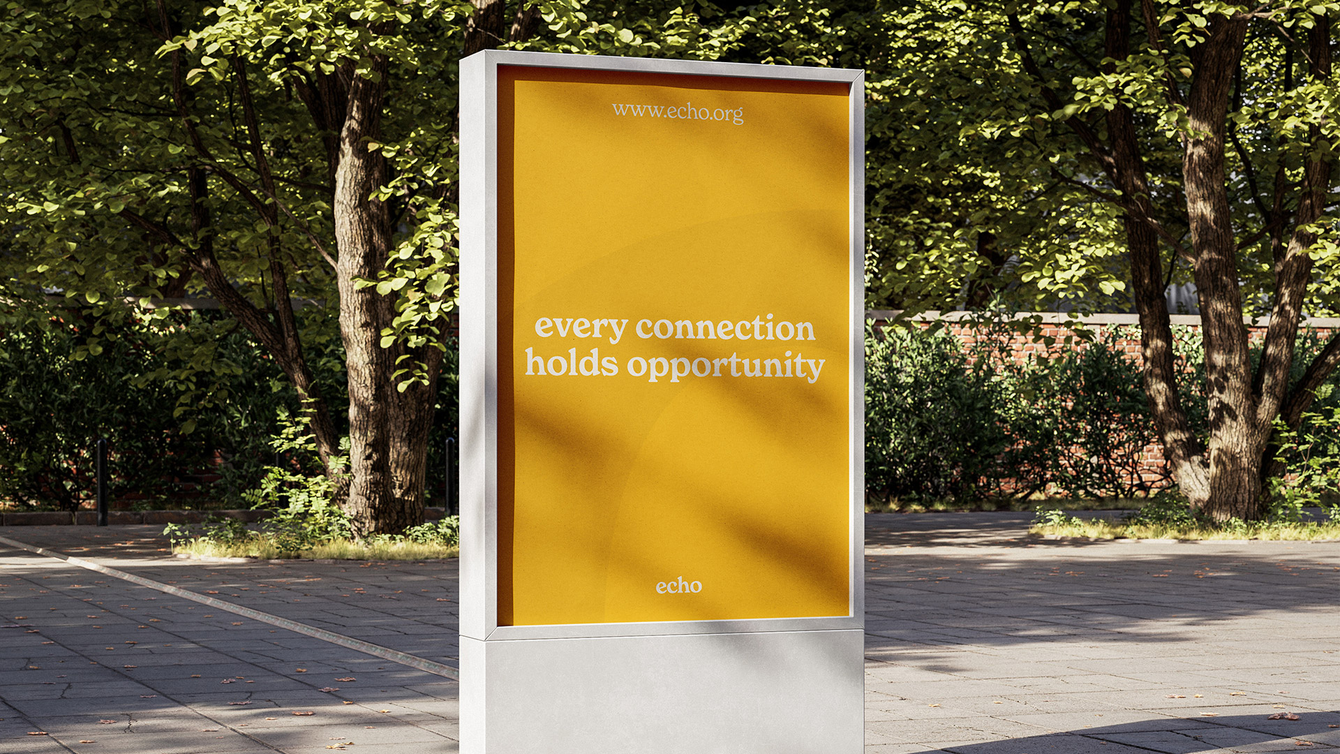
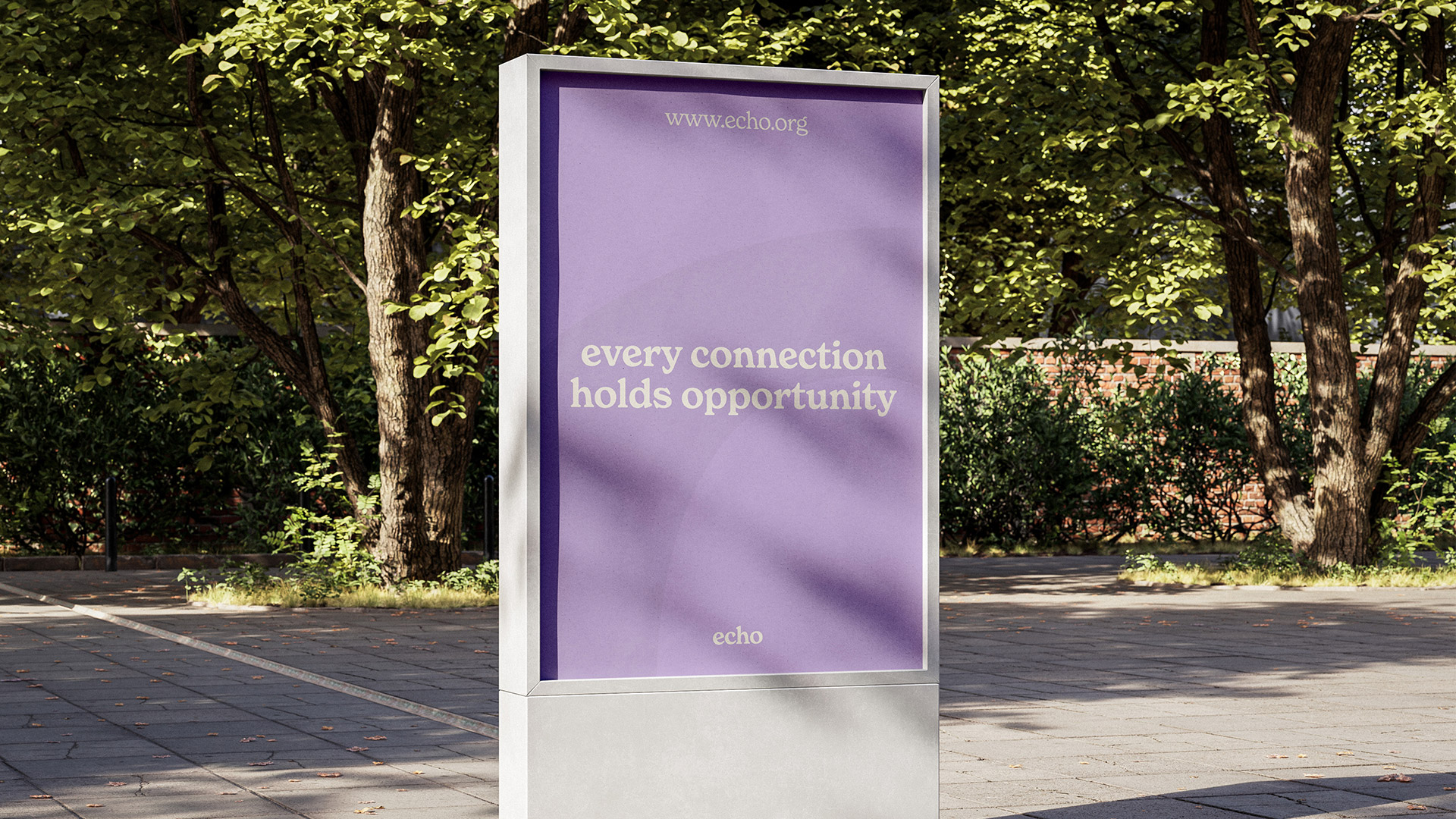
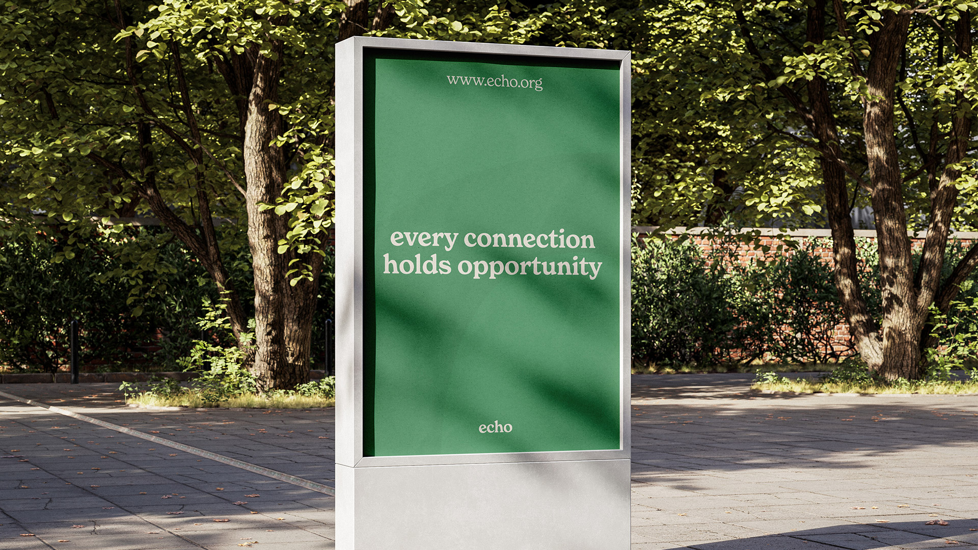
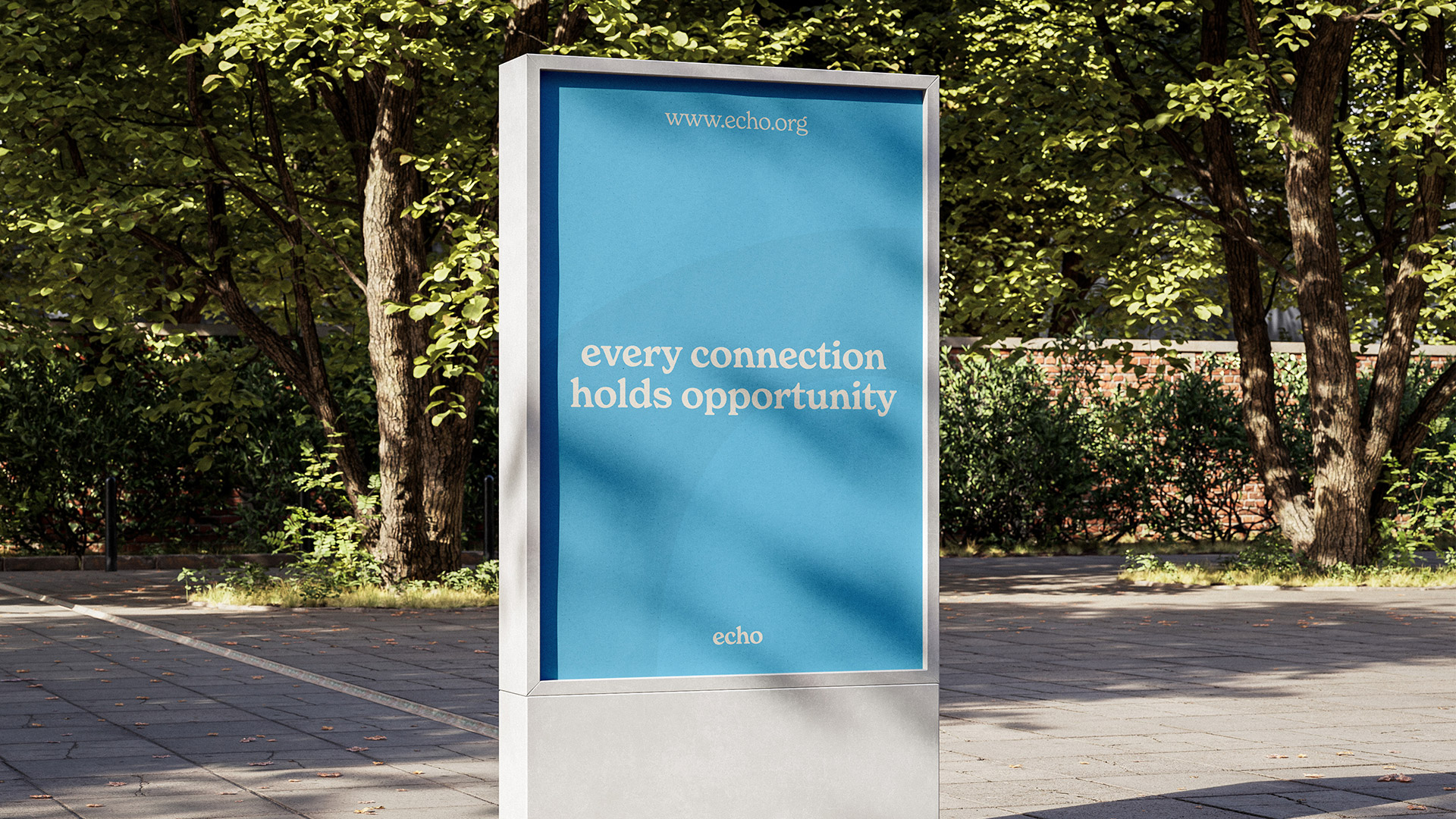
ECHO is designed as a flexible and responsive brand, ready to adapt to different moments, activities and atmospheres within the event. While yellow acts as the primary brand colour, symbolising energy, warmth and openness, the identity also incorporates a wider palette including green, purple and blue. These supporting colours allow the brand to shift and respond to different contexts, such as workshops, discussions or social activities, while still remaining recognisably ECHO.
By introducing variation within a consistent visual system, the brand maintains a strong core identity while avoiding rigidity. Each colour can be used to highlight different aspects of the programme or guide participants through the event, creating visual interest and clarity. This flexible colour approach reflects the spirit of ECHO itself: dynamic, inclusive and adaptable, yet always connected to a clear and recognisable foundation.