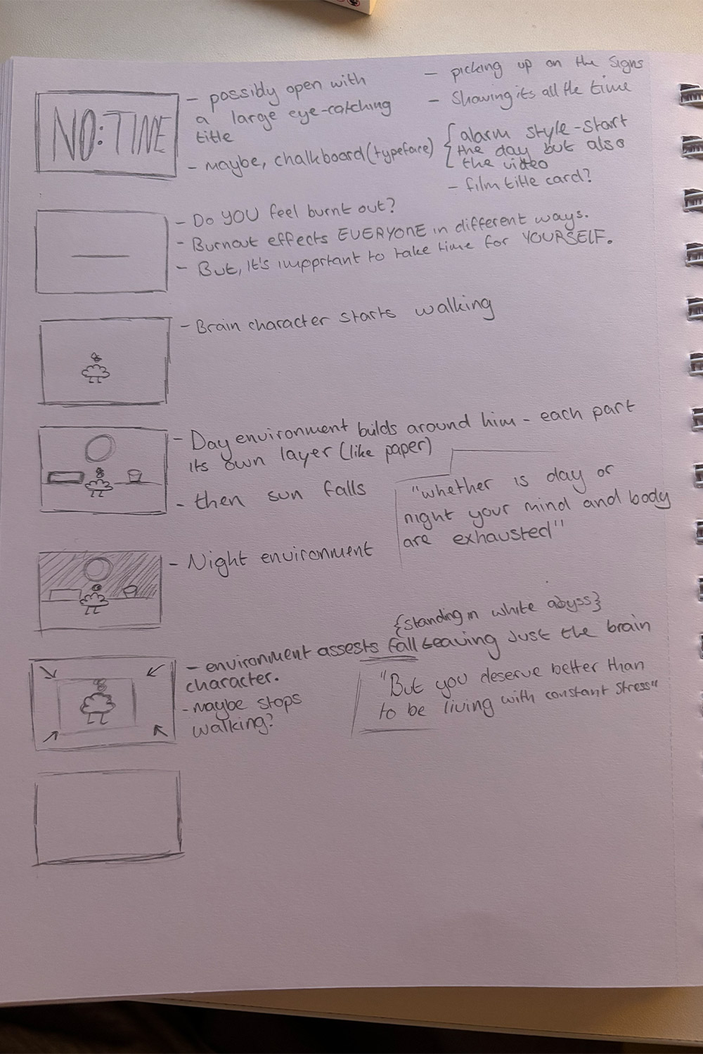
NO:TIME
How can animation be used as a tool to visualise and communicate the experiences surrounding mental health in an engaging and accessible way?
[ PROJECT OVERVIEW ]
This project focused on creating an animation aimed at students, exploring the theme of burn-out. As students ourselves, we were aware of how common and disruptive burn-out can be, yet how little it is openly discussed. After some initial research and brainstorming, we settled on this concept as a way to raise awareness and encourage understanding.
The team then faced a creative challenge: deciding on an animation style and the structure of the video. Experimenting with different approaches allowed us to refine both the visual language and narrative, ensuring the final piece effectively communicated the experience of burn-out while remaining engaging for a student audience.
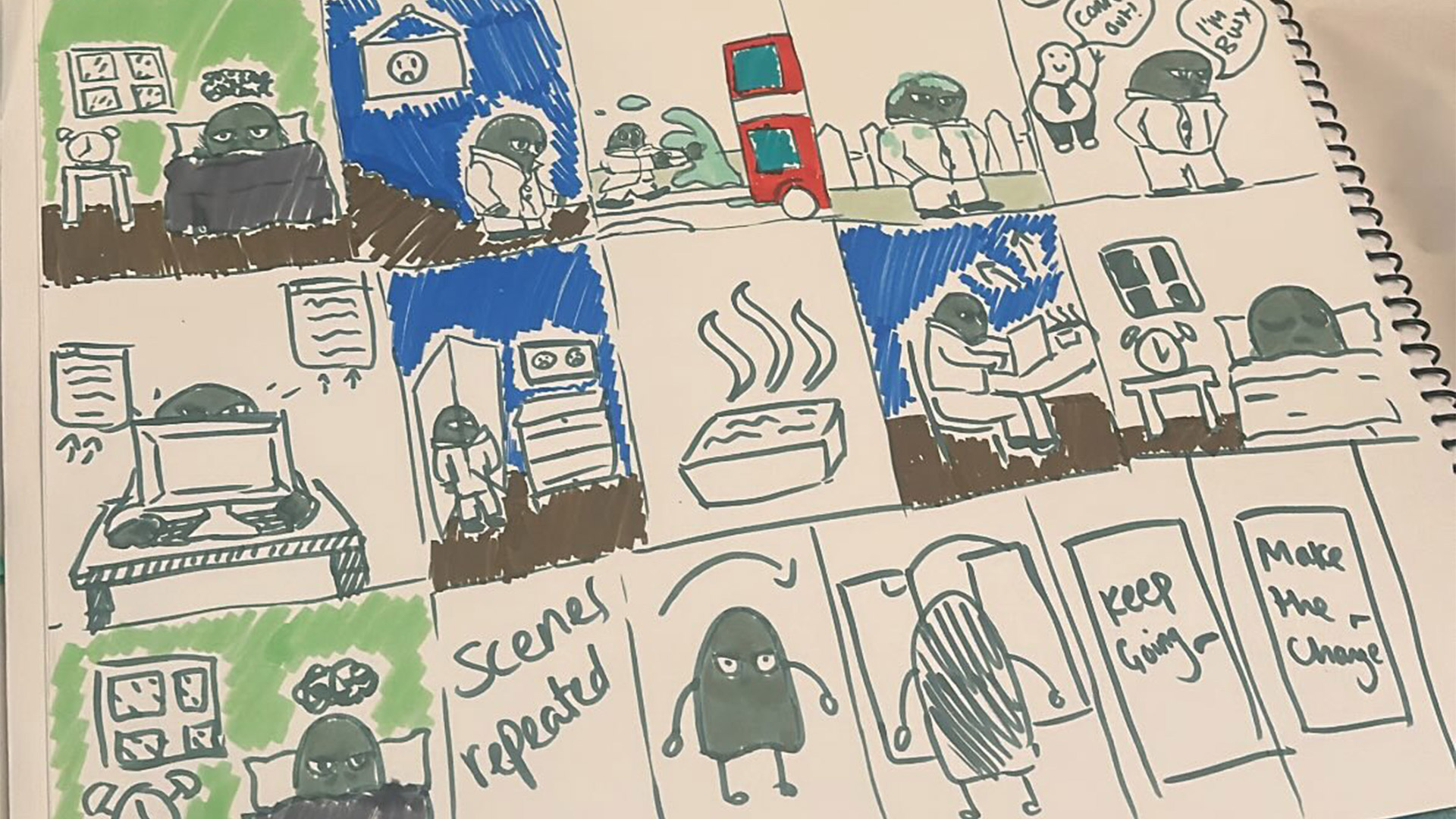
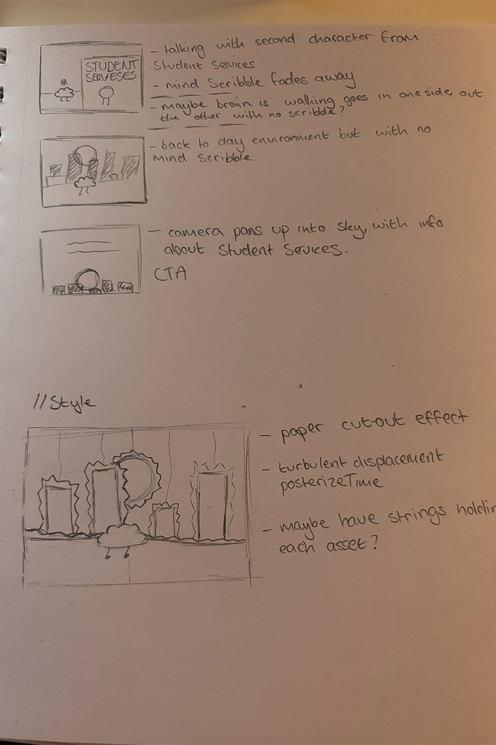
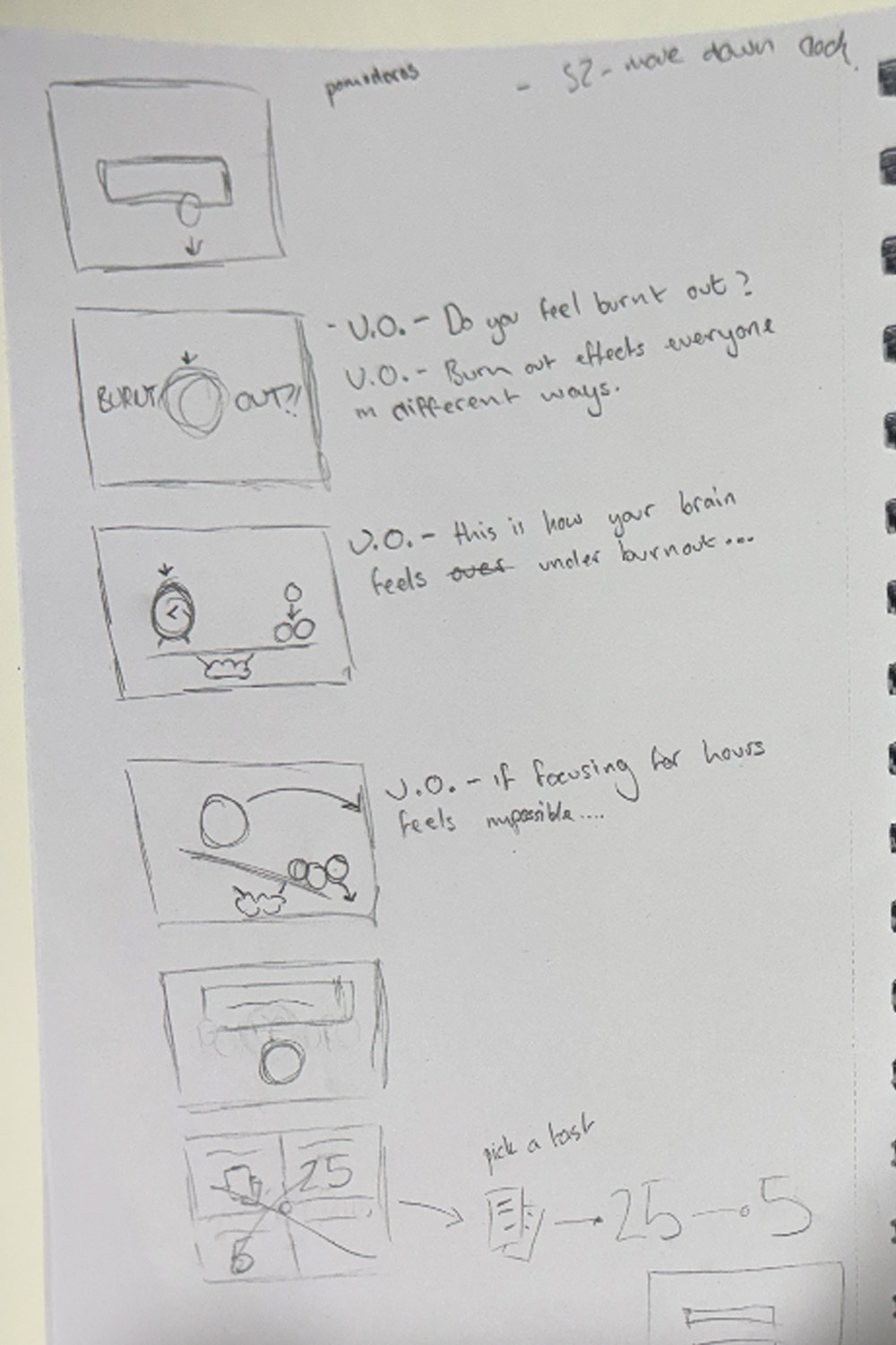
We created our original storyboard, but after receiving feedback on the animation, we realised it was too ambitious to complete within the time available. The story went through several revisions before we settled on a focused concept, highlighting the Pomodoro method as a practical tool for managing student burn-out.
For the test animations, I focused on exploring motion and timing to define the visual style. I created a smooth transition between a circle and a square, cutting on the fastest point of the motion to ensure it felt seamless. I also developed a simple bounce animation to add impact and energy, helping to establish the rhythm and dynamics for the final piece.
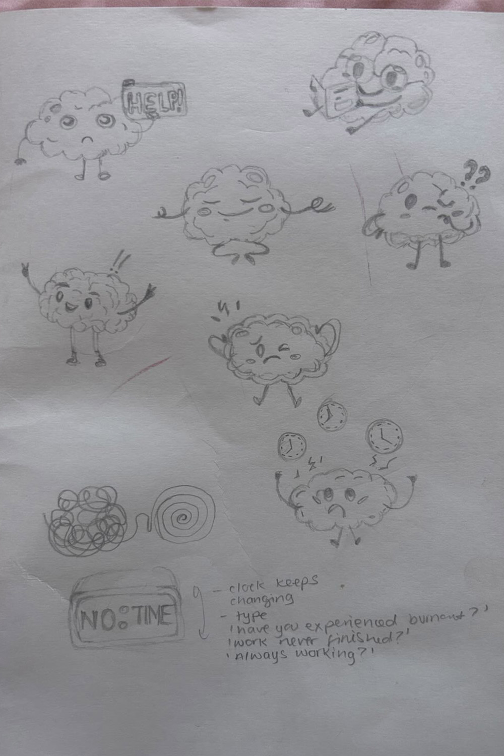
After refining the storyboards, we developed a character to carry the narrative. I focused on bringing the character to life by creating a walking cycle in Adobe After Effects, ensuring the motion felt natural and aligned with the rhythm of the animation. This stage helped define the character’s personality and made the story more engaging and relatable for the audience.
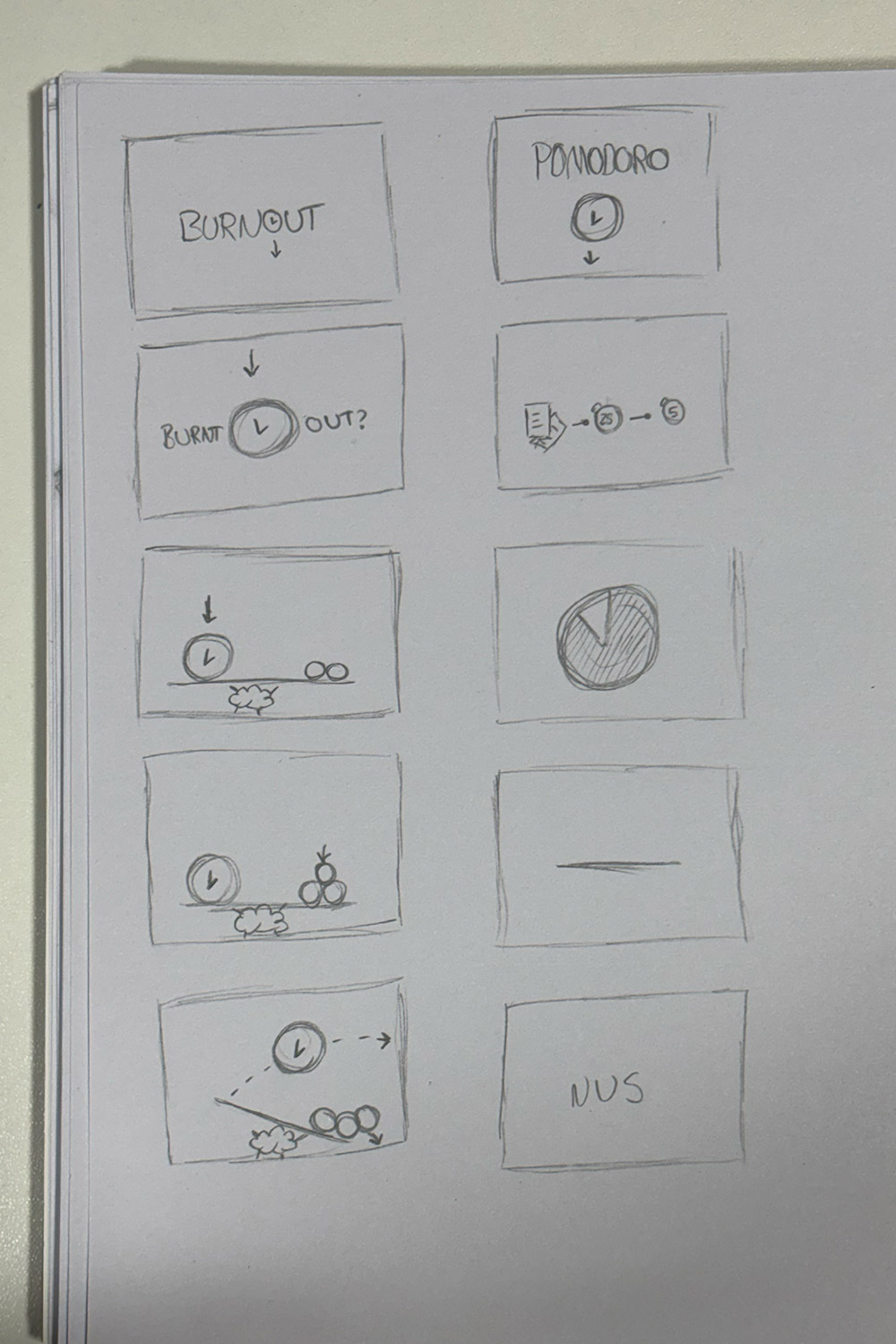
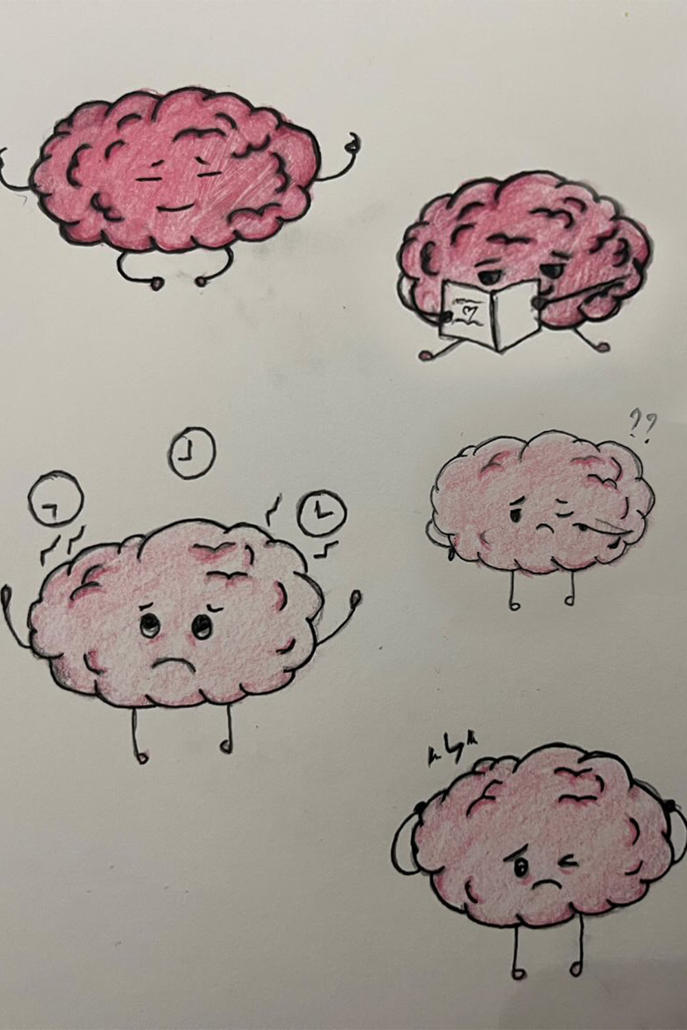
The “O” in BURNOUT became a central visual element, shaping the overall concept and guiding the animation. We also finalised the style, drawing inspiration from student notepads: textured paper, uneven lines, and subtle imperfections. To reinforce this tactile, dynamic feeling, we incorporated effects such as turbulent displacement, posterize time, and a displacement map, giving the animation a sense of energy and motion that reflects the theme.
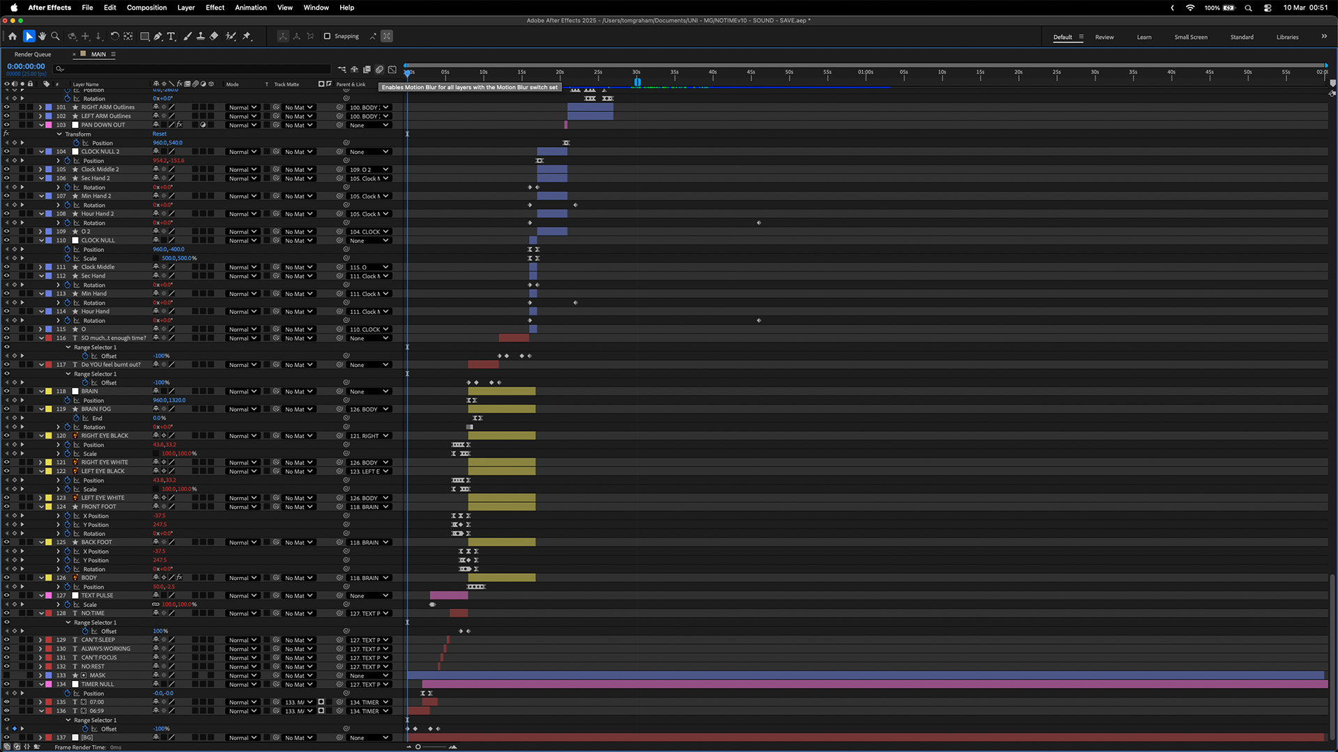
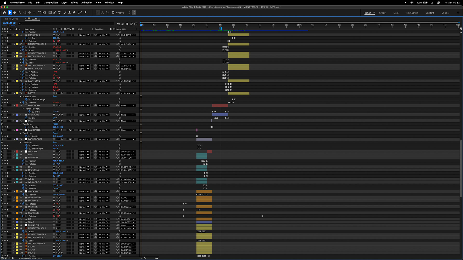
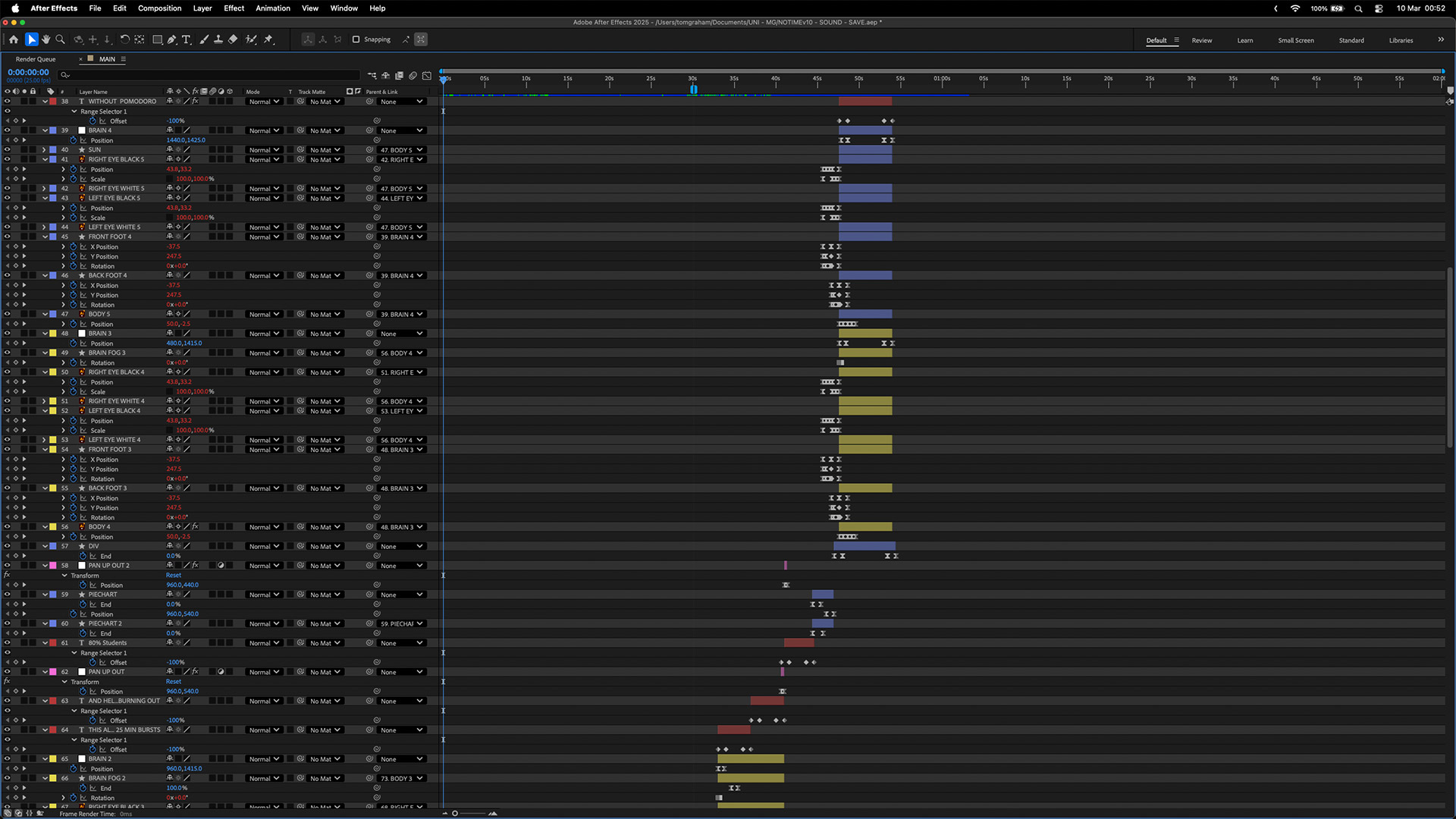
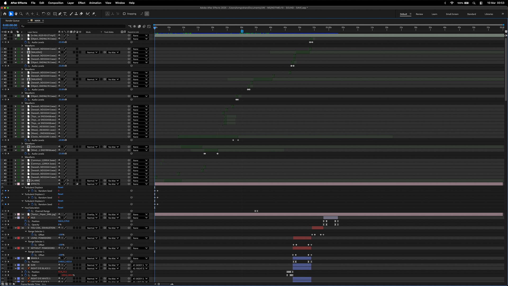
Working in Adobe After Effects, I was able to build the animation efficiently while maintaining a clean and organized project file. Layers were clearly named, colour-coded, and grouped logically, making it easy to navigate and update as the project evolved. This structure ensured a smooth workflow, allowed for quick adjustments, and supported collaboration within the team.